Before we dive deeper into website mistakes. Let’s try to understand the components of a website.
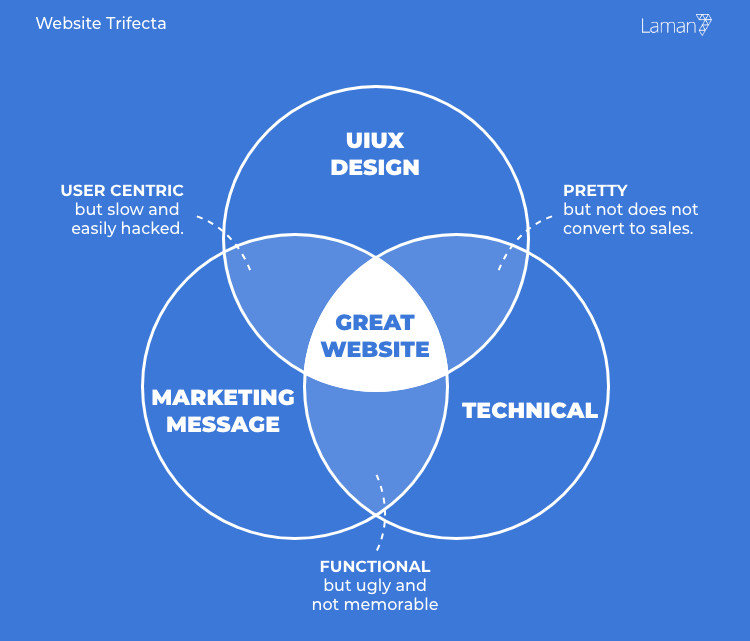
A website is a combination of 3 major components. Design, Marketing/ Messaging & Technical. I call this the website trifecta (we design and develop websites for the last 17 years and won awards too 💪🏻)
The three components must be in perfect harmony in order to build a good website. Look at the overlapped areas.
Your goal is to build a website that serves your business.
Otherwise, the website would be a cost, not an investment useless.
In this post, I am going to share with you the reasons why websites fail to help your business. Let’s break down based on the three components.
You can build better websites by using our Free Web Design Strategy.
Table of Contents
10 Technical Website Mistakes
“Speed is the name of the game, while not compromising the safety and functions.”
While pursuing speed, you must also take into account the function. If you don’t need it, remove it. Here are some technical website mistakes.
#1 No HTTPS
The website is insecure. The connection between your website and a visitor device may be intercepted. Search Engine (like Google) will not reward you on the top of the keyword search (even though you deserved it). Starting from July 2018, Google Chrome (the web browser) starts displaying signs like this. If you run an ecommerce website, you risk of losing 40% of the business.
Google announced in Feb ’18, Chrome 68 and above will show “not secure” in the address bar.
Google suggest websites to be loaded within 3 seconds.
#2 Not Mobile Responsive
In 2018, 54% of the websites are viewed from devices besides desktop. The number is expected to go up as humans prefer to visit websites on the go. While you can still pinch zoom to see the content, it will ultimately reduce the website experience and eventually leave the website.
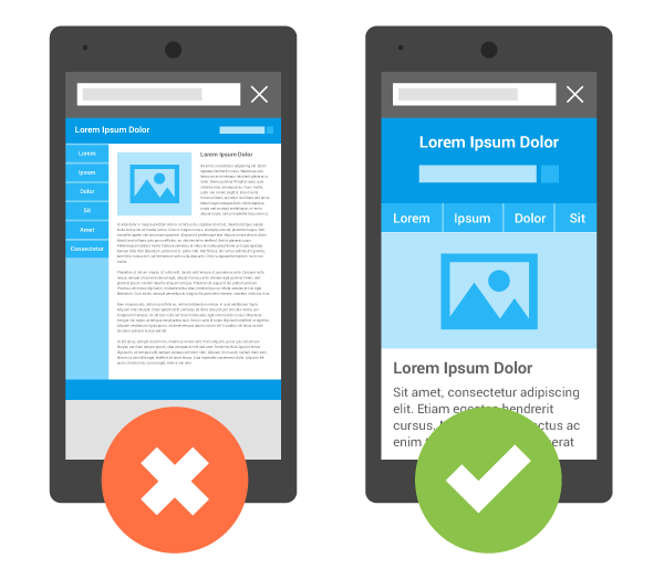
Source: Google Developer
#3 Loads Slower than 3 Seconds
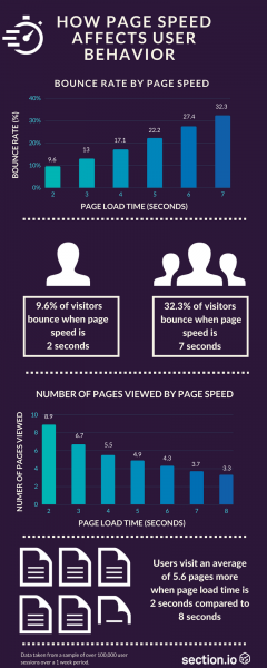
If your website loads more than 3 seconds, 40% of visitors will abandon the website and 80% of visitors will not return. Here’s an infographic from Section.io.
#4 Lack of Image Compression
While most visitors use high-speed broadband, there are times they surf in a congested area with limited internet speed on their mobile device. Image compression can reduce the size by almost 90% of the file, making it quicker to download. Let’s face it, nobody likes to wait.
#5 No Browser Caching
Browser caching helps the website to load quickly for the returning visits. This will also reduce the load on the servers to serve the content.
#6 Not Minified Scripts
Minified scripts help the website to load faster. While this may be a fraction faster, this also helps search engines to rank you higher.
#7 Not Working as Designed
Your website should function just like how it is designed. Meaning if you have a contact form, it better work. If you have a search function, it better provides the right results and so forth. Remember, websites are often the first interaction with your prospects, make it a meaningful one.
#8 Cheap Server Hosting
By cheap, I mean a shared server. In a shared server environment, resources like RAM, Processor, Traffic are potentially shared with hundreds of other websites. Thus making your website load slower.
#9 No Security Plugin
Security plugin helps to do two things, block attacks and scan for potential threats. Without a security plugin, your website is open to attacks.
#10 Not Leveraging on CDN
CDN helps to drastically improve the speed of website by serving files that are closer to your location. For example, my server is in Singapore and you are from Ohio. Using CDN, the website will be served from a nearer location like Oklahoma, instead of sending packets from Singapore.
Faster website impacts greatly on user experience.
Conclusion for Technical
Faster and functional websites are rewarded with more page views, more attention.
11 Marketing – Website Mistakes
Marketing is about communicating your values and sharing the benefits of using your product to your target audience. Let’s get started with the marketing website mistakes.
#11 Lack of Content
Visitors do not know what the website is about because it lacks description and context. 46% of the visitor leaves the website without further exploration or interaction.
#12 No Lead Generation Mechanism
Capturing leads can be done using premium content, email newsletter, Facebook Pixel or Google Marketing. This would not allow you to remarket your product and services to the visitor.

#13 Not Measuring the Website
The website can be measured using Google Analytics. When you don’t measure you miss a thousand chances to make the website better through engaging content, improve placement of button and lead generation. Here are some free and paid tools to track your traffic.

#14 No Clear Call to Action
Every website should compel visitors to do something. Even if the purpose is to provide information, the call to action should encourage visitors to remember it and return for updates.
#15 Lack of USP, Story, Concept
Customers have an abundance of options for products and services. What separates you from your competitors? Does the visitor have to dig into the website to find it? Your USP should be upfront. Tell your visitors why they should choose you! If you’re not doing this, your competitors are doing it.
#16 Lack of Contact Info
Without clear contact info, prospects struggle to find ways to get your product/services eventually gives up (to contact your company). Show location, general phone line, general email. Anything to help your visitors get to you.
#17 Not Answering Visitors Questions
Your visitors arrive at your website with sets of questions prior to their visit. Here are some questions you can ask yourself.
- Why you?
- How does this product help me?
- How do I talk to a real person?
- What do you actually do?
- Who do you serve?
These questions have to be answered in order to create an engaging website.
#18 No Privacy Policy
20% of Internet users read the privacy policy. Privacy policy shows a plan for the website to protect the visitors, even though they do not understand what it means.
#19 No Return & Warranty Policy
Return & Warranty is important for the eCommerce website. It provides assurance that you will fulfill your promise if any goes wrong.
#20 No Shipping Rates & Option
Shipping details provide a clear understanding of how much it cost and who will fulfill the shipment. 30% of eCommerce is unlikely to make a purchase for an unknowing shipping cost and courier.
#21 Poor Copywriting
Copywriting is the content on your sales page. The common issue is trying to sell to the audience immediately. You start talking about yourself, your business, how good you are etc. In the old days, that may work. Today, there is a mountain of competition. Your message should be about the customer, what problem are you solving, how do you provide value for your services.
Conclusion for Marketing
Again, I would like to reiterate, it’s about communication. Your headline should force the visitor to read the sub-headline and so forth. Provide as much information as possible in brevity.
10 UIUX Design – Website Mistakes
On the contrary to belief, UI (user interface) is not abstract. There are parameters to define “beauty” for websites. These are the balance of elements, color, alignment, proportion and so forth. There are 14 principles in Graphic Design, refer to Wikipedia.
Meanwhile, UX (user experience) directs the user to perform the desired action on the website, for example, “download this content”.
UI website mistakes can easily be seen and fixed, unlike the other two.
The UX however, may required you to revamp the website. Here’s a guide to revamp your website.
#22 Inconsistent Layout
Inconsistent layout, for instance, is a different menu navigation placement on every single page. Visitors and prospects will have to relearn the pages’ navigation ultimately making them leave the website because it’s too hard to digest.
#23 Using Banner Slides on the Main page
Sliding Banner (Carosell) will induce a “banner blindness”, where the visitors do not want to wait for the website to load all of the images. This will also slow down the website.
#24 Poor Use of White Space
White space is important to reduce clutter, encourage interaction, creates balance and act as separator on the website. Too many elements may induce eye fatigue and visitors leaving the website too early.
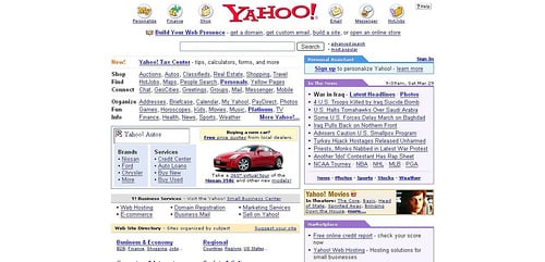
Remember Yahoo in 1998? I didn’t have much choice then, but would you use it today? I know I wouldn’t.
#25 Ugly/Irrelevant Image
While relevant images help to support the content, irrelevant images do the opposite, create more questions about the content. Visitors will struggle to find the meaning ultimately leave the website.
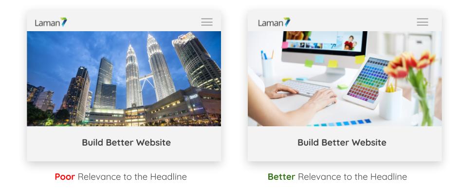
Image on the left showcase the KL Twin Tower, it has very little relevance to headline as compared to the image on the right.
#26 Hidden Navigation
Making the visitors work to find your content will have an adverse effect on usability. If visitors can’t connect with your message and content, they will leave.
#27 Mixed Typography
Three (3) is the maximum typography (or fonts) before visitors lose interest and get confused with the content. Adding more fonts will also increase the loading speed and create conflicting emphasis on content.
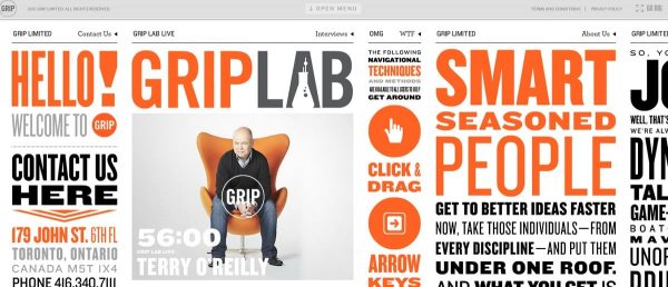
What do you feel about this website? Creative or a jungle mess? Do you know where to start reading?
#28 Content is Not Scannable
Websites are meant to be scannable. Does this mean lesser content? No. The content should be structured based on headings, point forms, quotes, bold, italicize and highlighted.
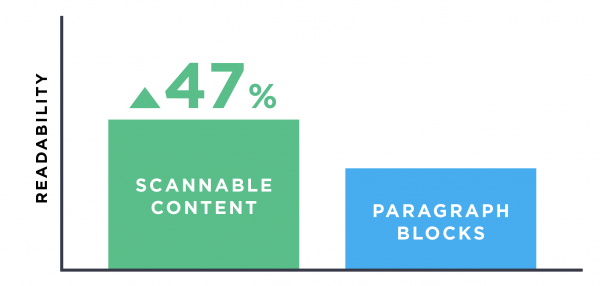
According to Backlinko (SEO agency), a website with scannable content has higher readability versus long lengthy paragraphs.
#29 Poor Search function
Your visitors, especially e-commerce wants to find your product/services quickly. The search function helps the visitor to master large and complex websites. Without the search function, your visitor will feel defeat and give up on your website
#30 Using Generic Images/ Stock Photos
Stock photos are good for one thing, mockup. Beyond that, the usage of stock photos should be limited to periodic content or blog posts. Using stock photos hinders the visitor to have a taste of what your company is about. It does very little to gain their trust.
The image on the right may not be as high quality (lighting, composition, etc) as on the left, but it provides mean to determine the experience with the company.
Conclusion for Design
Design is a matter of taste. People have different opinions about design (aesthetic) however, you can’t argue with the technical aspects of design.
Choose the look that evokes the right emotion for your business. Use your Corporate Image (CI) as guidelines. If you don’t have any, make one.
UIUX design website mistakes are often overlooked, but it is not as critical as marketing and technical website mistakes.
Website Mistakes Takeaway
Your website needs to be snappy quick, functional and secure. At the same time appeal to the target market and encourage them to take the desired action. The goal is simple, do very little to piss your visitors off.
What does your website say about your company? Best websites start with Strategy.
Avoid these website mistakes to generate more leads.
Not sure what to do? Hop on to our Free Marketing Consultation.


