Website design styles is basically how the overall look and feel of the website.
Often there are times when I was told by my customer to design something “fresh”. So I started designing according to my definition “fresh”. It turns out I was wrong! What he mean “fresh” was new. I thought “fresh” was something like realism with veggies. Mind you we were building a corporate website platform. So the term “fresh” brings different meaning to other people.
Here are some common terms customers use; “simple“, “modern“, “cool“, “fresh“, “new“, “fun“, “pop“, “luxury“, “elegance“. Which really means differently to other people.
So to eliminate the confusion in website design style, I wrote this post. Of course this list is not sorted in any order.
1. Realism Web Design Style
Most websites would go with realism. In fact, it is encouraged. Realism is basically websites that are using photos as their main focus. Whether it’s people, food, render of products or even fashion. This is used mainly to convey transparency of their offerings, “you get what you see”. Here are some examples.


2. Fonts Web Design Style
Font based website design style is one of my favorite. It’s basically using different type of fonts to convey the website as a whole. This is also a combination of accent, two-toned and color gradients. The downside of using fonts website design style is getting it right. You have to know which word to prioritize.
 https://principles.design/
  https://2017.stateofeuropeantech.com/
  https://amessagefrom.earth/
3. Flat Design Web Design Style
Flat Design style is not uncommon. It was made popular in 2015. Flat designs are mostly images/ graphics in 2D and can sometimes be layered. Hence the name flat. It’s as if the 3D objects are smashed into the screen. The good thing about flat design is that it’s everlasting. It’s also very easy to design because tonnes of icons are readily available.
 https://patients.debiopharm.com/
 http://insuranceexperiments.org.uk/

4. Isometric (new) Web Design Style
From a glance is similar to Flat Design websites, but the term isometric suggest that it’s 3D and same dimension throughout. Isometric can be really challenging to build, because lots of graphics design will be involved in the process. Isometric website design style can take some time to build. The good things is, it’s very unique and shows your identity.


5. Freehand Drawing (new) Web Design Style
Ever since technology is getting cheaper and easily accessible, freehand drawing is getting a lot more attention. Tools like Surface Pro and iPad Pro has enabled designers to literally draw on the screen. Years ago, we had to use Wacom Intuos, which was very expensive. Freehand website design style is unique and normally a mix of realism and flat design. The downside of this design, it can get really messy.
 https://team.redcollar.digital/


6. Scandinavian or Minimalist Web Design Style
I prefer to call it Scandinavian but it’s widely accepted as minimalist. Scandinavian because their design is based on “cut the fat” and focus on cleanliness. While it does look like a very simple website, the process behind it isn’t! The first thing we need to do, is gather every element you want in a website, then remove “the fat” bit by bit.
Imagine a car, then remove the bits down to its intended use. You’d probably be left with chassis (or frame). But from an outsider point of view, it’s a lazy job, and that’s the downside of it.
 https://www.hampshirelight.net/
https://norebro.colabr.io/ 
https://getobachan.com/
7. Combination Web Design Style
Lastly a combination of style. This can be a total disaster or turnout to be great. The key is knowing when to stop when you’ve pushed the boundary. The combination of styles are usually no more than 3. Beyond that, you’d notice the website looks like it’s being butchered or looked like it was pieced by a lot of people. This website design style probably takes the longest to achieve and it’s best done inhouse instead of hiring a web designing team.


https://www.campaignmonitor.com/
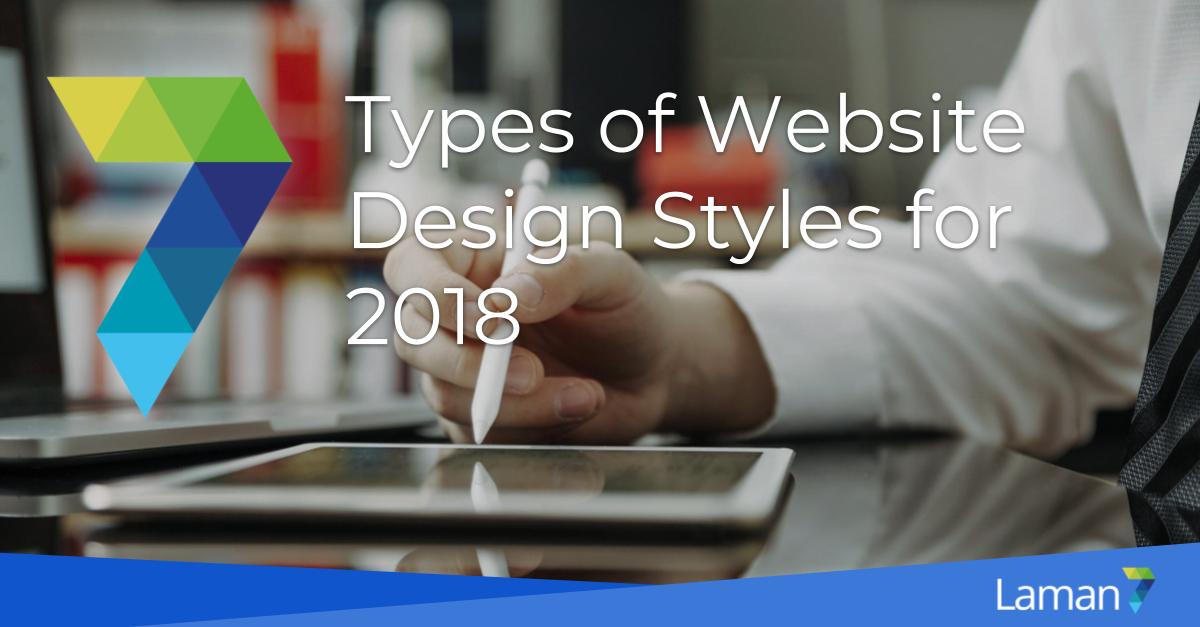
Conclusion for Website Design Style for 2018
Whichever way you go, there is neither right or wrong way. The most important factor is not look good, but something of meaning to your target users. With that, I’ll leave you a quote:
A Successful website is not for the owner, but for the readers (users).
I hope you’ve enjoyed reading this post. Looking forward to piece up more post like this. Like always, when you need a web developer, you know who to contact.