Do web visitors care about web design? Yes, they do. See below…
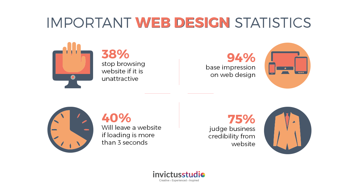
Based on the statistics above, 75% of the people judge your business credibility from the website while 38% will stop browsing website if it is unattractive. This shows that keeping up with trending web design is essential in creating the first impression.
In business, first impression is very important apart from your elevator pitch. According to Forbes, it took only 0.05 seconds for a person to form an opinion about your website and business personality that makes you stand out.
Besides, the web currently is an impressive world where we can display information in almost any design we want. Hence, the choices are endless and it all depends on our design creativity. So, the end of the year is getting closer, are you ready for the web design trends of 2019?
8 Web Design Trends 2019 You Don’t Want to Miss
Forget about the superficial list, this is the 7 ultimate web design trend of 2019.
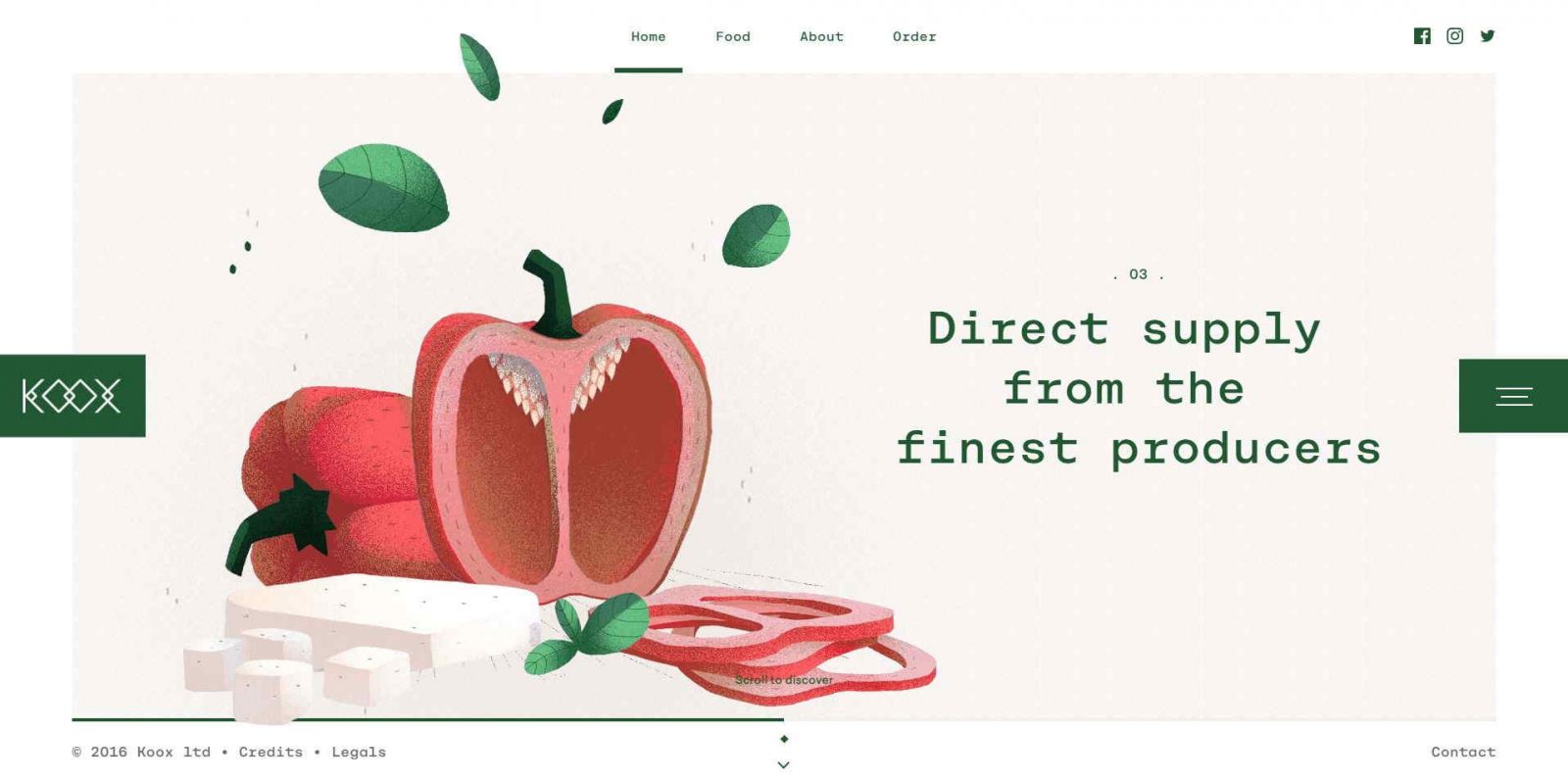
Trend 1: Move over, flat design. Make way for digital handwork.
Awwwards
Illustrations are still in, but it will no longer be the flat design. Illustrations are either more 3D or seem more hand-drawn. Lookout for brush strokes, wriggly lines, digitally colored ‘hand-drawn illustrations’.
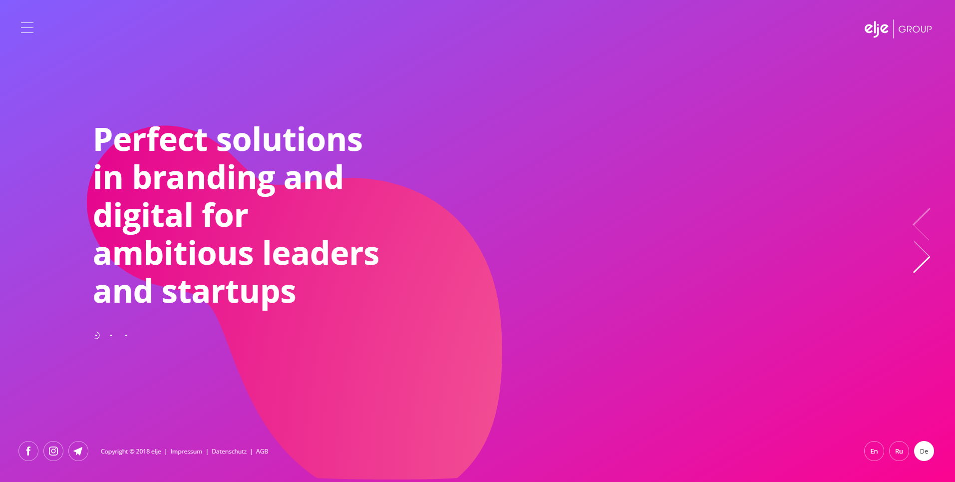
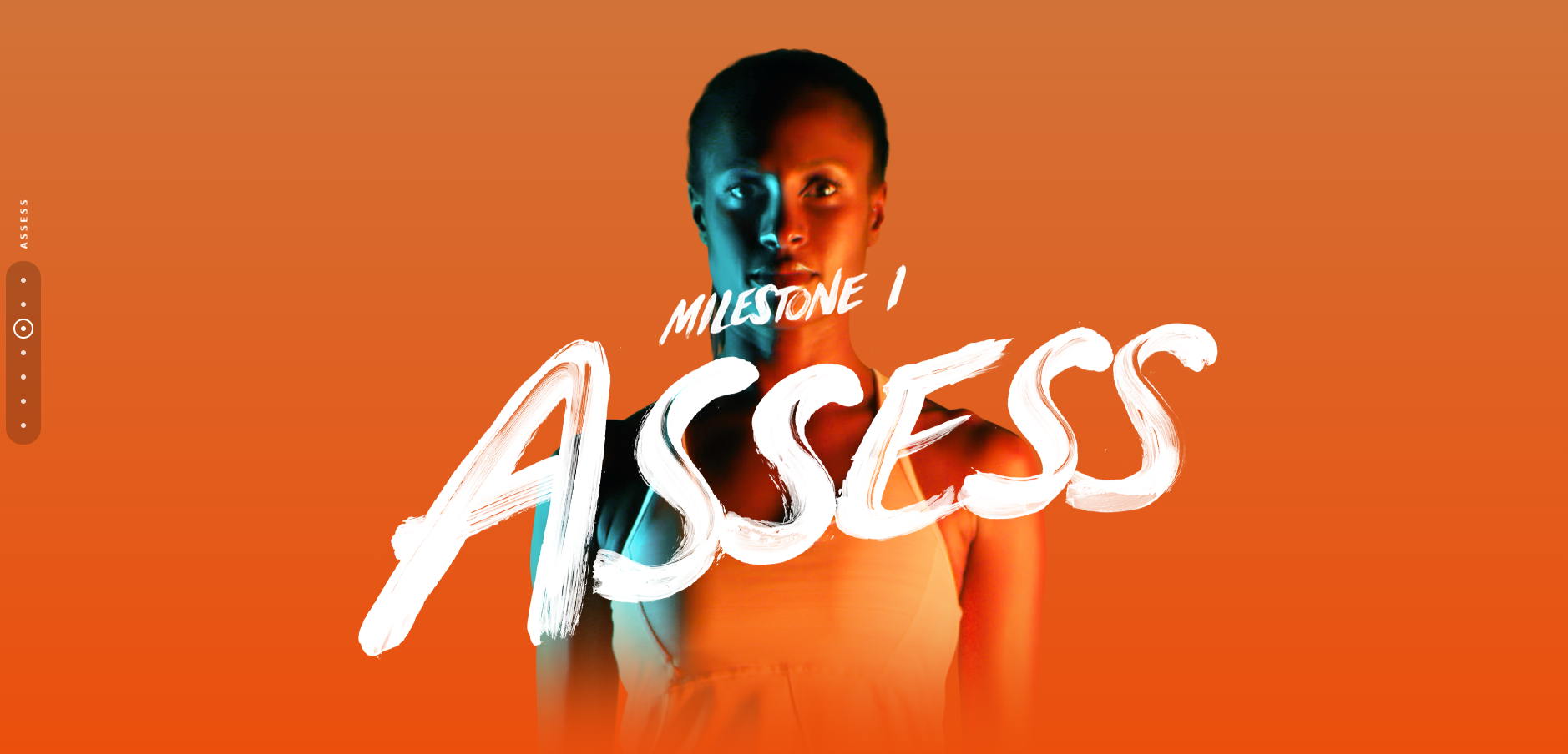
Trend 2: Gradients & Dual Tone
Awwwards
Gradients and dual tone can be applied across a myriad of elements. From images, texts, buttons, lines, overlay -they can instantly add modern feeling to the design. However, too much can make the design seem cheap. Do it well and you will end up with some impressive results to an otherwise mundane color. You’ll have to play a lot with color scheme. So, use it wisely.
Trend 3: Data Driven Design
This is a trend that is happening and will continue to stick. This method uses data from a website or survey to design a web that will truly be useful for the targeted audience. Designing web based on actual data to create a unique website that caters specifically for the website purpose. It also includes the planning for the user journey design to complete the experience.
Trend 4: Statistics Driven Design
In cases where data is not available, designers can look at statistics to determine the best web experience to offer to the audience. The statistics can be made as a point of reference for certain decisions regarding design and planning based on the website’s unique goal.
Trend 5: Authentic Heroic Images

With high competitions nowadays in business nowadays, one of the emerging trends is using authentic images to earn trust. Some may use images of the people behind the business, or real people using the products (or photo shoot into that setting) all depending on your nature of the business. The audience can tell right away if the pictures used are authentic or bought from stock photos library. When the images used are authentic, it is easier to gain trust towards the brand.
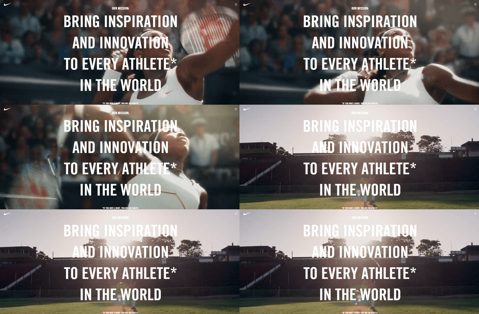
Trend 6: Get bored with Static Image? Hit of with Video Backgrounds
Nike
When your audience lands on your page and the video streams in the background, it somehow catches their attention. They’re likely to stick around your website to watch the video and this causes them to stay longer on your page leading to a higher conversion rate – better SEO, better rank.
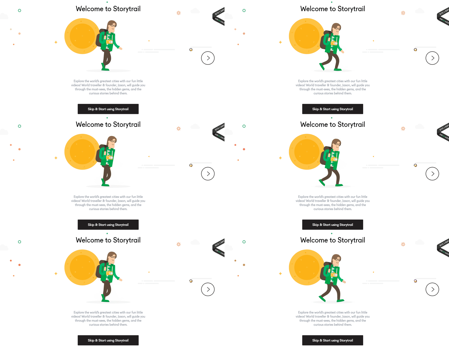
Trend 7: Work-out with Integrated Animations
Storytrail
Speaking of effective communication with the audience, more and more website are shifting from static images into animations in order to create engagement (normally in .gif format). This can be applied to work with navigations, scrolling or as the main focus of the website. For example, the graphic can animate when audience hovers on the image or scrolling down the page. This will make them feel excited and triggered to find more exciting things on your website.
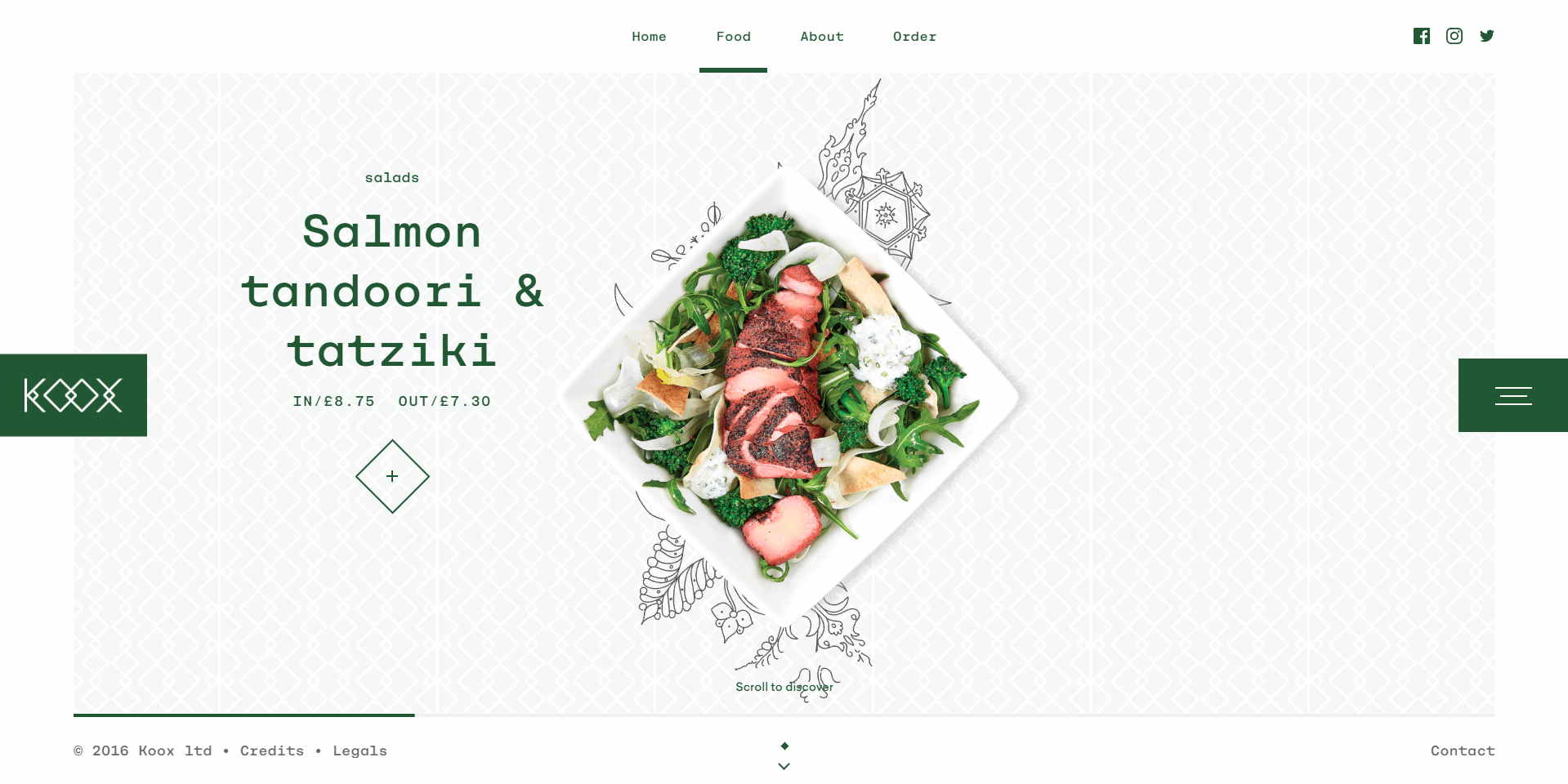
Trend 8: Go Fresh with Living Illustration
 Awwwards
Putting real cut-out image with shadows on illustrations will enhance and drives attention to the image on your website. It makes your website looks creative, fresh and bold suitable for business that wants their audience to focus on their products. You can also place a hero-style image by using this concept with full-width of your website. I believe, this trend is going to make a hit in 2019.
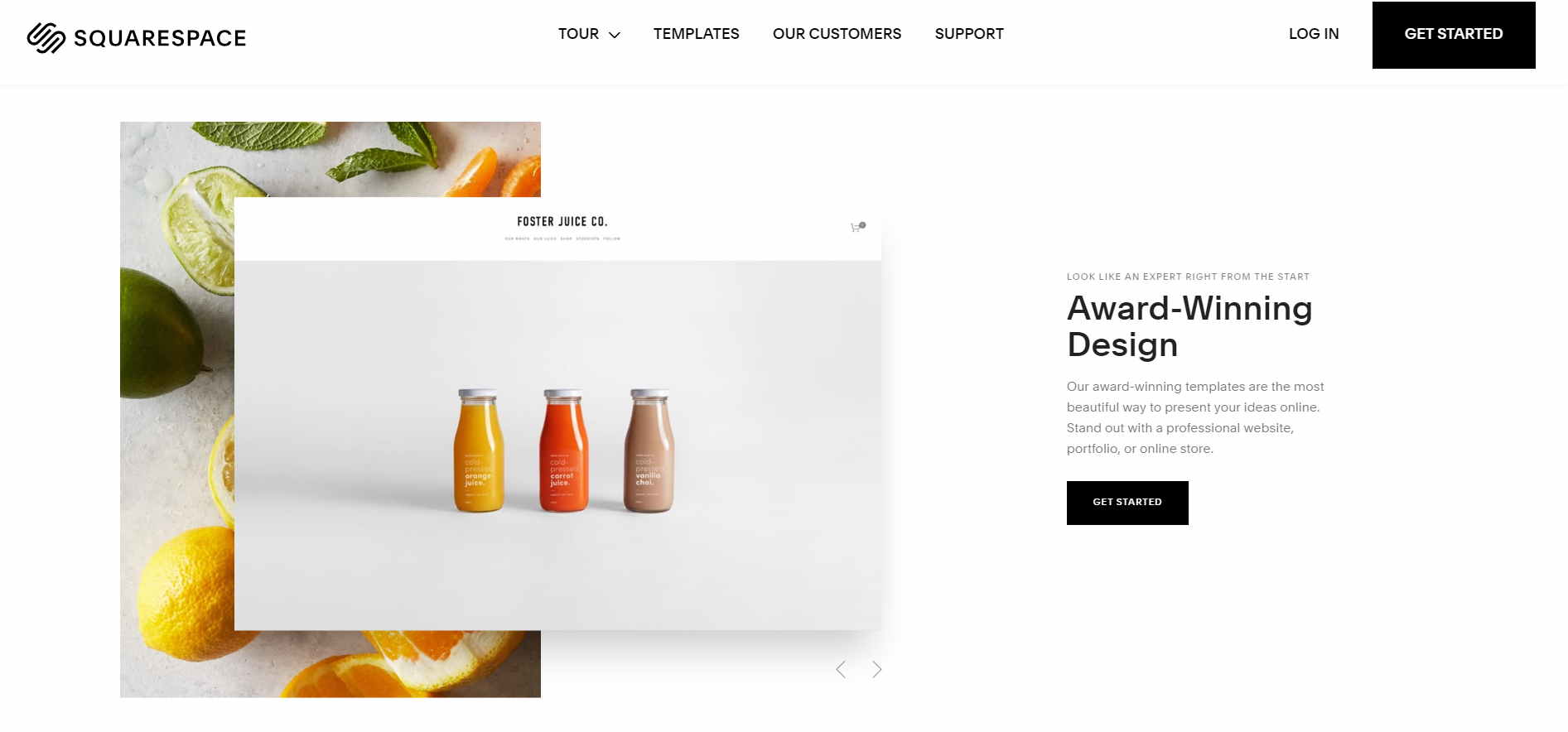
Trend 9: Overlapping
 Awwwards
Having elements off-grid, overlapping each other with shadows will make your element stand out. Overlapping elements shares the same space and likely to float without touching each other giving it the three-dimensional view. The design brings out aesthetic throughout your website while captures audience interest to the specific content.
7 Web Design Trends That Already Outdated
 Have you ever looked at the pictures of the people from the 70s and wonder “How on earth did they find this disco suit so beautiful?” It seems ridiculous. Well, fashion trends are meant to come and go. Same goes to the web designs trend. As your website end up with outdated designs, you need to make way for the latest trend to stand appeal.
Now, let’s have a look at the trends – the old-fashioned trends that need a pull-out.
1. Meaningless Call To Action Slider
Several common mistakes people usually do in the slider section is too much happening and no clear call to action. Sometimes, they slide to fast causes audience miss the message. Millennials don’t watch this anymore.
Keep your message clear and simple. Highlight the problems and wants that match their needs. This is called a value proposition. You might actually get them to click on your button if you successfully tap their main desire.
2. Flat Boring Images
Flat design is a minimalistic design approach that emphasizes usability. Mainly, it focuses on open space, crisp edges, bright colors, and 2D illustrations. It used to be popular around 2012, but now flat design seems to be overloaded. Another problem with flat design is the audience is unable to differentiate which was the button since it is lack of signifiers on clickable elements.
3. Hamburger Menu For Desktop
Well, hamburger icons are still relevant for mobile view due to limited space to display your menu but not for desktop view. Hiding your navigation menu really doesn’t help your audience in finding your website usability. It is best to show what you want them to see on your website.
There are just many other ways for you to be a minimalist, but hamburger is just not the thing.
4. Sidebars and Widgets Overload
Some designers just get a little bit too happy that they’re having a widgets or sidebars party – especially WordPress where they’re a lot of interesting widgets to play with. Remember this, just because the widgets/sidebars are made available, that doesn’t mean you need to use it. It’ll jumble up everything on your pages and distract your audience attention. Just focus on the important elements.
5. The Carousels
While it is still a hot item on a shelf, the data has shown image carousels are bad for conversion. According to research from usability analyst, Craig Tomlin carousels don’t work because most users don’t stay longer than 10 seconds on a page. They might just miss the valuable information on the 6th slider. Besides, the average Click-Through Rate is below 1% which kills the conversion rate. (Source: Useful Usability )
The worst part is that even if they stay longer, they will be more confused by the multiple messages displayed in the sequence of carousels images.
6. Auto-Play Music
This is a big no! This is not an alter-ego blog that you’ve created when you were teenagers. Besides, not all your audience wearing headphones while browsing. This can irritate your audience when suddenly the music just start out so loud and unwelcome.
7. Unrealistic Stock Photos
We all agree that visual element captures the audience better than text and stock photos seem to be the savior – save cost on hiring a professional photographer. However, the awkward part is that your audience has seen them again and again that causes no differentiation between you and the competitors. Use real photos of your team, buildings, products as it creates trust and authenticity. I’ve mentioned this in Trend 5.
Principles of Web Design Trend To Boost Conversion
Although designs trends form the basis of a website to stand out, to gain ROI and revenues, you need to think beyond the basics to drive audience towards conversion. Now, let’s get a little bit closer at the principles to boost website conversion:
- Aesthetics
 Of course, it’s hard to satisfy everybody since different people have different taste. But you can follow these key rules.
-
- Use only 2-3 fonts for the entire website.
- Use max 4 colors
- Use high resolution and relevant images
- Structured and readable texts.
- Value
 Value is giving important information for free, like a blog post, articles, testimonials and the benefits of your products or services. According to Brian Tracy, the audience doesn’t buy products, they buy the results the products will give them. Thus, by highlighting this high-value piece of information, you can command your audience to listen about your products and services.
Sell the value, the price can become less and less important or otherwise they will keep talking about the price.
- Speed
The rule of thumb is 2-3 seconds. Studies show that audience will start to lose their interest if a site doesn’t load within 3 seconds.
- Flow of Website
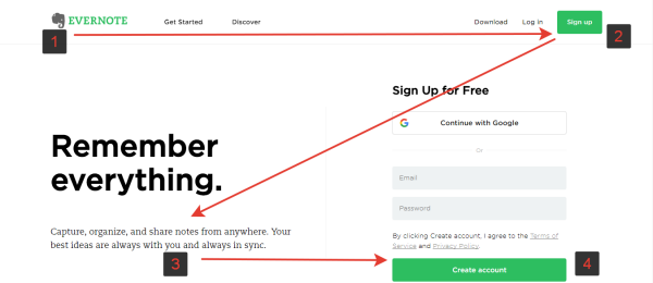
There is so many information in your website that you need to cue the important points for the audience to avoid confusion. Plan the flow and make them naturally follow the information to make a decision that leads to your contact form or call-to-action (CTA).
- Copywriting
Now you have all the above, here comes the most critical point of boosting your website conversion – the copywriting. For me, copywriting is all about telling a good story. That’s why the audience wants to read it as long as it doesn’t look like an ad.
Tips! Using the Value Proposition Canvas for your copywriting to define your audience pain, needs and wants easily. The key is to be in total control of the audience’s experience.
Are You Ready to Compete with Web Design Trend 2019?
2019 will be another year when we see rapid changes in online trends. You need to be aware of what is trending to stand out.
Whichever your designs are, there’s no right or wrong. The most important factor in web design is to be something meaningful for your targeted audience and be able to drive them towards your conversion. I hope you enjoy reading this post. If you need a web designer, you know who to ring up.


